2024
B2C • Web Application
Gemeente Amsterdam Veilig
Designing a safer, more humane way to connect citizens with government benefits
Duration
3 weeks
Team Size
4
My Role
Product Designer (UX strategy, research, interaction design, system logic, prototyping)
Client
Gemeente Amsterdam (Government of Amsterdam)
Agency Coach
Overview
This project was undertaken as part of my Master’s in Digital Design, in collaboration with Gemeente Amsterdam.
The brief was not to redesign a single interface, but to rethink how government benefits are distributed. Today, citizens must actively apply for resources, while eligibility is assessed through rule-based algorithms that often lack transparency, context, and empathy.
We asked a fundamental question:
How might government systems match resources with citizen needs in a way that is humane, transparent, and trustworthy, without increasing risk or complexity?
The Challenge
In the existing system:
-
Citizens must request benefits they are already entitled to
-
Algorithms flag potential fraud without explanation
-
Decision-making lacks human context
-
Data usage is opaque, reducing trust
-
Services are fragmented across multiple portals
Design challenge beyond UI:
Translating complex technical systems—algorithms, data permissions, blockchain contracts—into interfaces that everyday citizens can understand and trust.
Research Insights – Where Trust Breaks
From citizen interviews, we identified consistent patterns:
-
Users didn’t know where to start
-
They feared making mistakes
-
They didn’t understand decisions
-
They felt powerless in the system
Critical insight:
The system optimizes for control and fraud detection, not for clarity and trust.
This shifted our design goal from efficiency to decision safety and transparency.
Strategic Reframing
We made two foundational design decisions:
1. One unified, citizen-first portal
Organized around life situations (e.g. safety, housing, income support), not departments.
2. Explainable and auditable decisions
Eligibility logic, data usage, and access rights are visible to citizens.
This aligned citizen needs with institutional responsibility.
Designing Trust into the System, Beyond UI
We explored blockchain conceptually as an infrastructure layer to support:
-
Verifiable eligibility logic
-
Traceable data access
-
Immutable decision records
-
Clear accountability
Blockchain was not presented as a feature, but as a trust mechanism operating behind the interface.
Designing Under Ambiguity
Constraints included:
-
Evolving policy rules
-
Limited access to real government data
-
Legal and accessibility requirements
-
Short academic timeline
Design approach:
-
Clarify assumptions early
-
Design for uncertainty
-
Prioritize ethical responsibility over speed
-
Focus on decision quality over completeness
Failure Prevention & Trade-offs
In GovTech, success is often measured by what does not go wrong.
This design actively reduces the risk of:
-
Wrong benefit applications
-
Blind trust in opaque algorithms
-
Untracked data access
-
Premature over-automation
Key trade-off:
More transparency adds cognitive load, but reduces systemic risk and long-term distrust.
Simple System Flow
-
Citizen starts with a life situation (e.g. safety, housing, income support)
-
System requests only essential data
-
Eligibility rules are evaluated via smart contracts
-
Each decision step is logged on the blockchain
-
Citizen can see:
-
What data was used
-
Why a decision was made
-
Who accessed their data
6. Outcomes are either:
-
Approved
-
Requires clarification
-
Escalated to a human caseworker

Caption: Automation balanced with human oversight to reduce risk and preserve accountability.
Design Solution
Rebuilding Trust, Transparency, and Usability in a Public Digital Services Platform
The solution reframed the platform from a transactional government portal into a trust-first digital service ecosystem, designed to reduce cognitive load, clarify complex processes, and give citizens explicit control over their data. The experience was intentionally structured around three critical moments in the user journey: pre-engagement (landing), first-time use (Day 0), and repeat usage (Day N), supported by a transparent, end-to-end agreement flow.
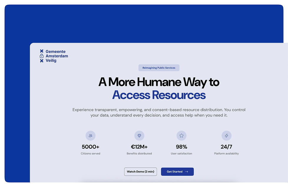
Landing Page (Pre-Sign-up Experience)
Strategic Intent: Trust, Clarity, Expectation Setting
A trust-first landing experience that sets expectations upfront, explaining how the platform works, how it improves legacy systems, and how user data is protected, reinforced by social proof.
Dashboard – Day 0 (First-Time User Experience)
Strategic Intent: Reduce Uncertainty Before Action
A first-time dashboard that builds confidence by surfacing eligibility signals, data usage principles, and service readiness before users take action.


Dashboard – Day N (Returning User Experience)
Strategic Intent: Operational Clarity & Ongoing Trust
A personalized dashboard giving real-time visibility into application status, benefits, and data sharing, reinforcing trust through continuous transparency.

Create Digital Agreement – End-to-End Flow
Strategic Intent: Simplify Bureaucracy into a Predictable Digital Process
A guided, end-to-end agreement flow that converts complex government procedures into a clear, step-by-step digital journey, covering eligibility, data consent, review, and secure submission.


Outcome & Validation
We stopped at concept and hi-fi prototype stage. To validate:
-
Tested with the same citizens from initial interviews
-
Presented at the MDD Feedback Feast, receiving input from visitors, faculty, and peers.
-
Measured whether the new flows solved real problems
.jpeg)


Observations:
-
Users easily understood where to start
-
Felt more confident navigating eligibility scenarios
-
Better understood decisions
-
Reported higher trust in system and data usage
Algorithm & Ethics
Rather than optimizing fraud detection, the system was redesigned around:
-
Explainability
-
Minimal data usage
-
Accountability
The focus remained on ethical technology, not automation for its own sake.
Key Learnings
-
Ethics must be designed in, not added later
-
Transparency builds trust faster than automation
-
Good UX reduces systemic risk, not just friction
-
Decision quality outweighs speed or pixel perfection


