2021
Enterprise • Web Application
MyPod — Modern Enterprise Intranet Redesign
Increasing daily adoption by designing for employee intent, not organizational structure
Role
UI/UX Designer (End-to-End)
Duration
6 Months
Client
Bitwise India (via Fifth Estate Agency)
MyPod is a redesign of Bitwise’s internal intranet, originally fragmented, content-heavy, and underutilized.
The project focused on reducing cognitive overload, clarifying employee priorities, and reframing the intranet as a daily work companion rather than a static information dump.
Instead of adding features, the redesign removed friction, aligned the system to real employee workflows, and introduced clear information hierarchy — resulting in measurable improvements in adoption and engagement.
Impact: +65% daily usage & +70% employee participation
Note on confidentiality: Due to enterprise security constraints, actual user data, internal metrics, and sensitive content are anonymized or abstracted in the UI visuals shared.

The Starting Point: What Was Broken
The existing intranet failed not because of missing features, but because it did not respect how employees actually work.
Key challenges identified:
-
Employees could not quickly find relevant or timely information
-
Content felt top-down, static, and disengaging
-
The interface lacked hierarchy, clarity, and trust signals
-
No sense of community, recognition, or participation
From a business standpoint, this translated into:
-
Low platform adoption
-
Repetitive HR queries
-
Missed internal communication
-
Poor ROI on an internal product already in use

Caption: The previous intranet prioritized content volume over clarity, forcing employees to scan, search, and guess where to act.
Research & Understanding The Real User
Methods Used
-
Stakeholder interviews (HR, team leads)
-
Employee interviews across departments
-
Usage pattern analysis of existing intranet
-
Competitive benchmarking (enterprise intranets & collaboration tools)
Key UX Insights
-
Employees scan, not read internal platforms
-
Relevance is time-bound — “What matters today?”
-
Recognition and visibility directly influence engagement
-
Trust increases when systems feel predictable and transparent
These insights directly informed every design decision.
Design Strategy
The redesign was guided by three principles:
1. Information First, Always
Content hierarchy was rebuilt to surface:
-
What’s new
-
What’s relevant
-
What requires action
2. Engagement Without Compromising Security
Community features were introduced within enterprise constraints, avoiding public-social paradigms while still enabling participation.
3. Progressive Adoption
Instead of overwhelming users, features were layered to support gradual behavioral change.
Key Design Decisions & Rationale
1. Information Architecture Redesign
Decision:
Replace department-based navigation with task- and intent-based grouping.
Rationale:
Employees think in terms of actions, not org charts.
Outcome:
-
Reduced cognitive load
-
Faster access to frequently used resources

Caption: Navigation reorganized around employee intent, not internal structure, reducing time-to-information.
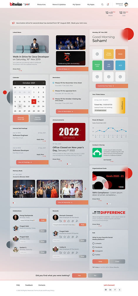
2. Dashboard as Modular System
Decision:
Redesign the homepage as a modular dashboard instead of a static content page.
Rationale:
User testing showed employees make a value judgment within seconds:
-
“Does this help me today?”
-
“Is it worth coming back?”
The modular approach allowed:
-
Clear visual hierarchy
-
Flexible prioritization of content
-
Future scalability without redesigning the core layout
Trade-off:
Personalization was intentionally limited to avoid security and governance risks common in enterprise environments.
3. Engagement & Community Features
Engagement was introduced carefully to avoid the perception of an “internal social network.”
Features Introduced:
-
Internal blog-style posts for sharing relevant articles and experiences
-
Lightweight reactions and badges to encourage participation
-
Celebration widgets for birthdays, work anniversaries, and achievements
Design Rationale:
Research showed employees were already sharing knowledge informally.
The goal was to formalize and surface this behavior, not create new friction.
Engagement features were designed to be opt-in, visible, and governed, aligning with enterprise expectations.
User Experience: Wireframe Directions
& A/B Testing
To validate navigation, feature prioritization, and engagement strategy, I designed three wireframe routes, each testing a different intranet model.
Wireframe Route 1 — Modular & Personalized
-
Sidebar navigation with dashboard layout
-
Business tools, ticket widgets, My Apps
-
Engagement features (celebrations, surveys, polls)
Focus: Balanced task visibility with optional personalization.
Wireframe Route 2 — Information-First & Global
-
Mega dropdown navigation
-
Global time visibility (India | US)
-
Announcement bar and IJP on dashboard
-
Engagement widgets with live polls
Focus: Immediate visibility of critical, company-wide information.
Wireframe Route 3 — Planning & Collaboration
-
Mega menu with app dashboard
-
Integrated calendar and task list
-
Group collaboration section
-
Rewards and event participation tools
Focus: Planning, coordination, and team visibility.


A structured survey was conducted with HR, developers, QA, PMs, and new hires.
What users preferred:
-
Mega menu over sidebar (lower cognitive load)
-
Dashboard-based My Apps
-
Announcements and IJP rated as critical
-
Engagement features increased likelihood of daily use
Final decision:
A dashboard-first layout with mega dropdown navigation, combining the strongest elements of all three routes.
User Survey Insights & Final Direction
Visual Design: A/B Testing & Finalisation
Two visual styles were tested on the validated wireframe:
-
Glassmorphism (Selected): Improved hierarchy, focus, and perceived quality
-
Flat design: Clean but less effective in guiding attention
Decision rationale:
Glassmorphism provided clarity and differentiation without compromising usability or accessibility.

Usability Testing & Results
Tested with 15 employees using task-based scenarios (remote).
Results:
-
96% task completion
-
42% reduction in time-on-task
-
55% reduction in errors
-
70% increase in engagement post-launch
“Everything feels much more intuitive now—I don’t get lost.”
- Senior Developer, 5+ years at Bitwise
Design System, Handoff & Constraints
-
Modular, component-based design system
-
Responsive layouts (desktop, tablet, mobile)
-
Accessibility-first (contrast, keyboard navigation, screen readers)
-
Developer handoff via Figma with documented logic and edge cases

Icons
Ticket Status Stages
.jpg)
.jpg)
Impact
-
+65% increase in daily active users
-
+70% growth in participation (events, polls, internal posts)
-
90% task completion for top workflows
-
Improved internal accessibility audit scores
Key Learnings
-
Early stakeholder alignment prevents rework
-
A/B testing reduces subjective decision-making
-
Accessibility significantly improves adoption
Future improvements:
-
Real-time feedback widgets
-
Multi-language support
-
Earlier legal/compliance involvement


